The Bilibili Movie Community allows fans to document their viewing history, write reviews, and connect over shared interests. Yet the detail page lacked functional depth, had low interaction entry points, and was visually outdated, leading to limited engagement and high user drop-off.
As the lead designer, I aimed to reshape the page into a streamlined, intuitive, and community-centric destination.
Design Optimization: Refine layout and interface for better readability and navigation
Feature Enhancement: Introduce new engagement mechanics to increase user stickiness and participation
Through initial user interviews with film enthusiasts and creators, I uncovered several usability issues with the Movie Community Detail Page—particularly in navigation friction, lack of interaction mechanisms, and underwhelming visual hierarchy. Users expressed that the page felt more like a static catalog than a living space to track and engage with movies.
To deepen my understanding and validate these early hypotheses, I launched a short-form user survey.

Survey Highlights & Design Implications
52% of users trust uploader recommendations most.
→ Prioritize creator content visibility to boost influence.
83% access reviews via movie lists, not the detail page.
→ Improve layout to increase relevance and discoverability.
66% want tracking features,
60% want collections.
→ Add tools for logging and personalizing movie journeys.
To further validate the user pain points and identify design opportunities, I conducted a competitive analysis on four major movie-related platforms—Douban, Maoyan, Taopiaopiao, and IMDb. This allowed me to observe common UX patterns and successful interaction strategies.
From this, I distilled key learnings in three dimensions:
Visual Design: Dark backgrounds combined with large posters or trailers helped capture users’ attention.
Layout Strategy: Information was presented in bullet points or modular blocks, enhancing clarity and scanning efficiency.
Functional Focus: Clear, consistent CTA buttons effectively guided user actions, especially for reviews, bookmarks, or ticket purchases.

Research and competitive analysis revealed key issues in the existing detail page: a cluttered layout, low user engagement, and weak sharing incentives.
To address these challenges, I identified three core design goals:
Streamline the browsing experience
Increase user participation through habit-building
Improve shareability with stronger visuals
To improve the usability and visual appeal of the movie community detail page, I focused on three key aspects:
I reorganised the page structure by conducting modular analysis. Non-essential information was moved to secondary pages, allowing the main interface to highlight core functions and decision-critical content—streamlining the user journey.
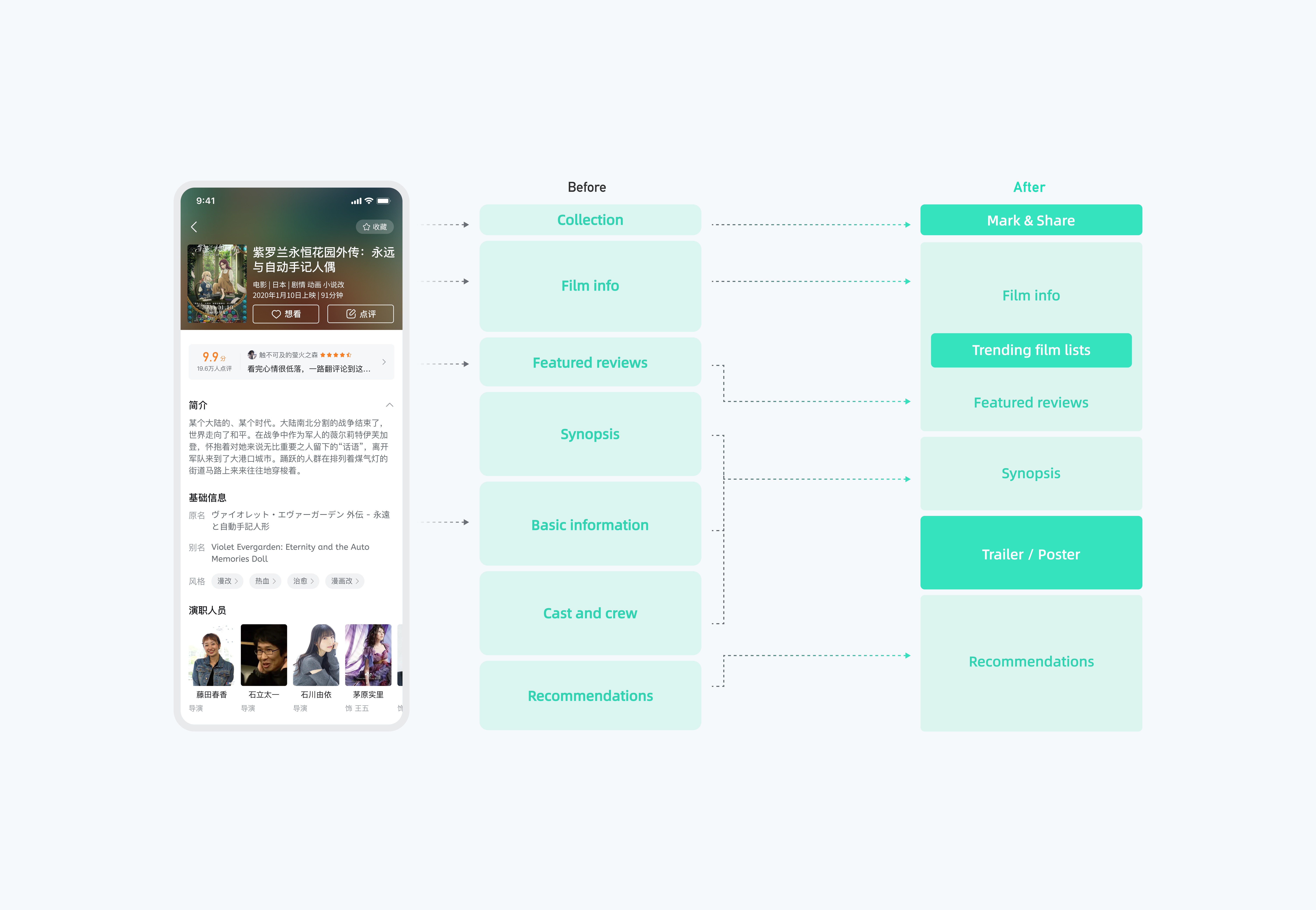
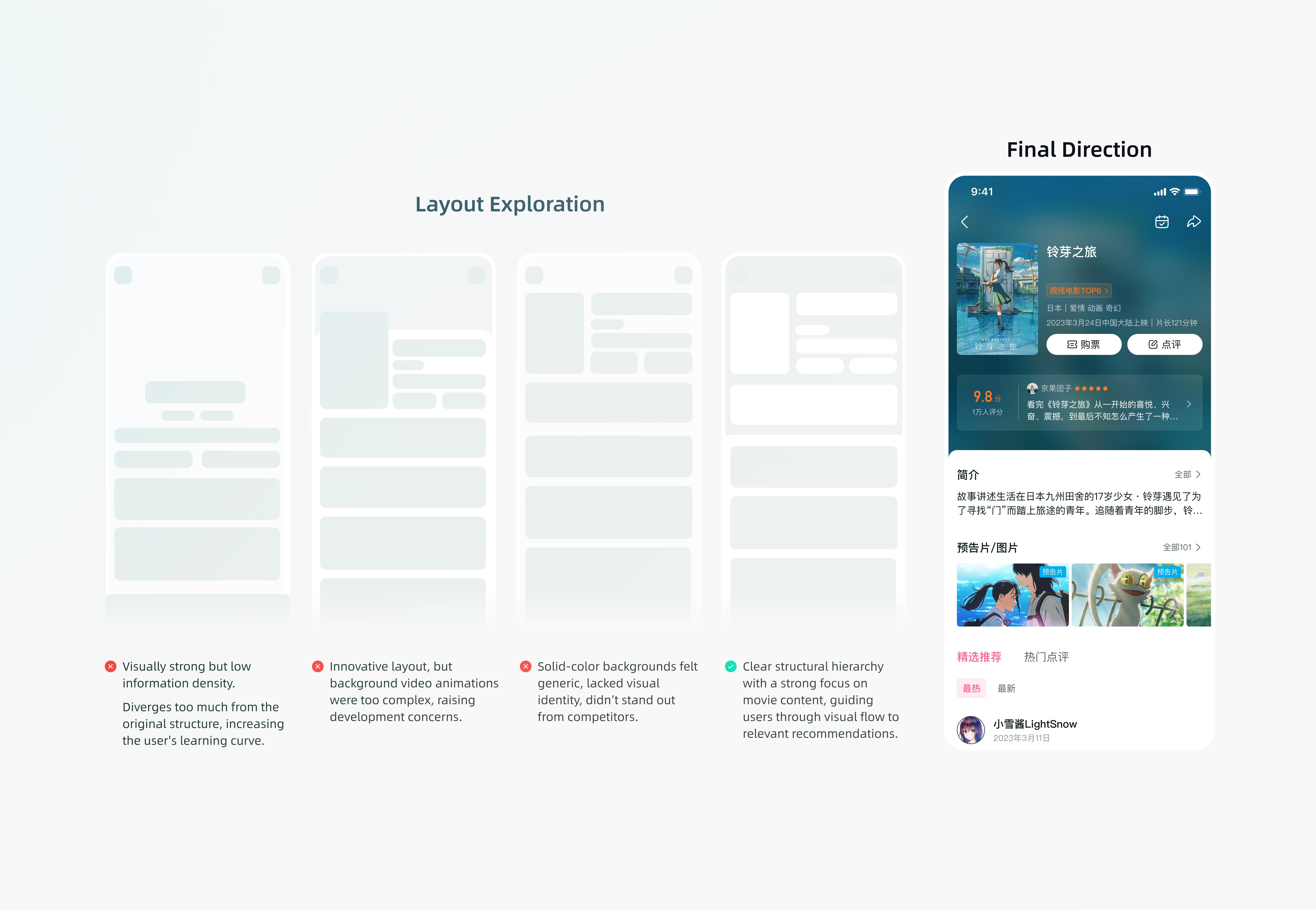
I explored multiple structural approaches to simplify the information hierarchy and improve clarity—testing different content groupings, layout flows, and visual emphasis. Through continuous iteration and collaboration with the product team, we landed on a streamlined design that surfaces key features and relevant content up front.
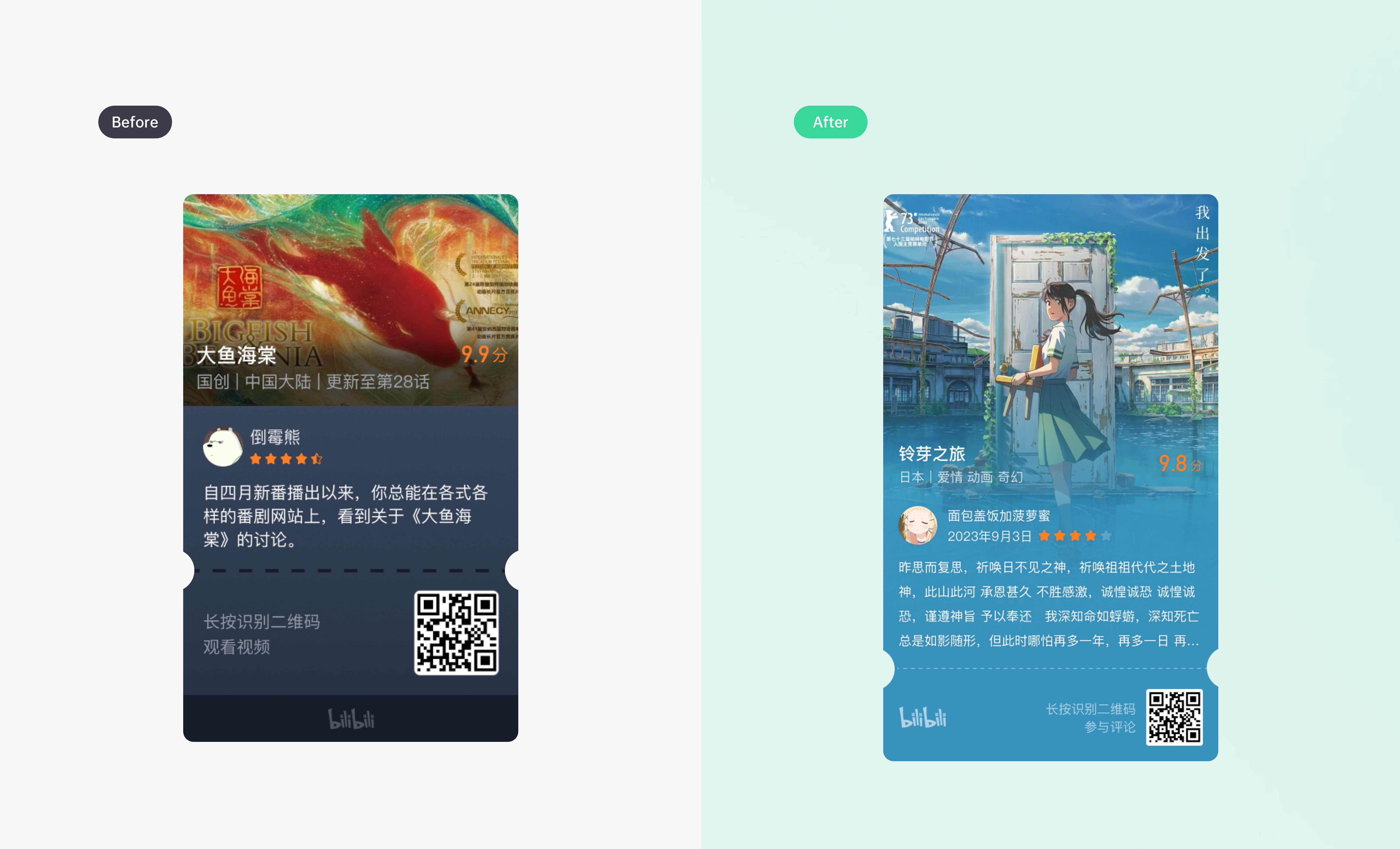
To create a more cohesive and polished experience, I standardised key design elements and reduced visual clutter, making the page easier to scan and more visually harmonious.
This included:
· Unifying color styles for consistent visual identity
· Refining the layout of long review modules
· Enhancing the typographic hierarchy for improved readability

To address the issue of low visibility and deep entry points, I introduced a new “Check-In” feature that encourages users to log their viewing activity. The goal was to build daily habits and strengthen community engagement by making the action more accessible, motivating, and rewarding. Given the content-driven nature of the platform, I asked:
To explore this, I adopted the Fogg Behavior Model (FBM) as a framework, focusing on three core elements:


To lower the barrier to action, I streamlined the check-in flow with a more intuitive and lightweight interaction design.

To encourage repeat engagement, I enhanced personal feedback visibility and added a visually-driven history module.