Overview
The Message Center is Bilibili’s core channel for creator-fan communication, supporting interactions via messages, likes, and mentions. Despite its centrality, it suffered from poor usability, fragmented functions, and outdated structure, weakening community engagement.
As the lead designer, I conducted a comprehensive UX audit, distilled key issues, and led a user-centered redesign aimed at improving communication efficiency and emotional connection — ultimately enhancing user retention.
The Problem
Initial audits and user feedback revealed systemic UX challenges — far beyond visual issues:
📉 Business Pain Points
Low retention and weak engagement
Underutilized messaging functions
Missed opportunities to drive community growth
😖 User Pain Points
Messages were buried under spam and low-value content
No clear structure or priority guidance
Poor sense of connection or reward from interaction
Goals
After aligning with PM and stakeholders, I narrowed the redesign into two primary goals:
Make messaging simple, organized, and relevant
Enable meaningful, emotionally rewarding interactions between creators and users
Design Strategy
Based on these insights, I developed a three-tiered strategy:
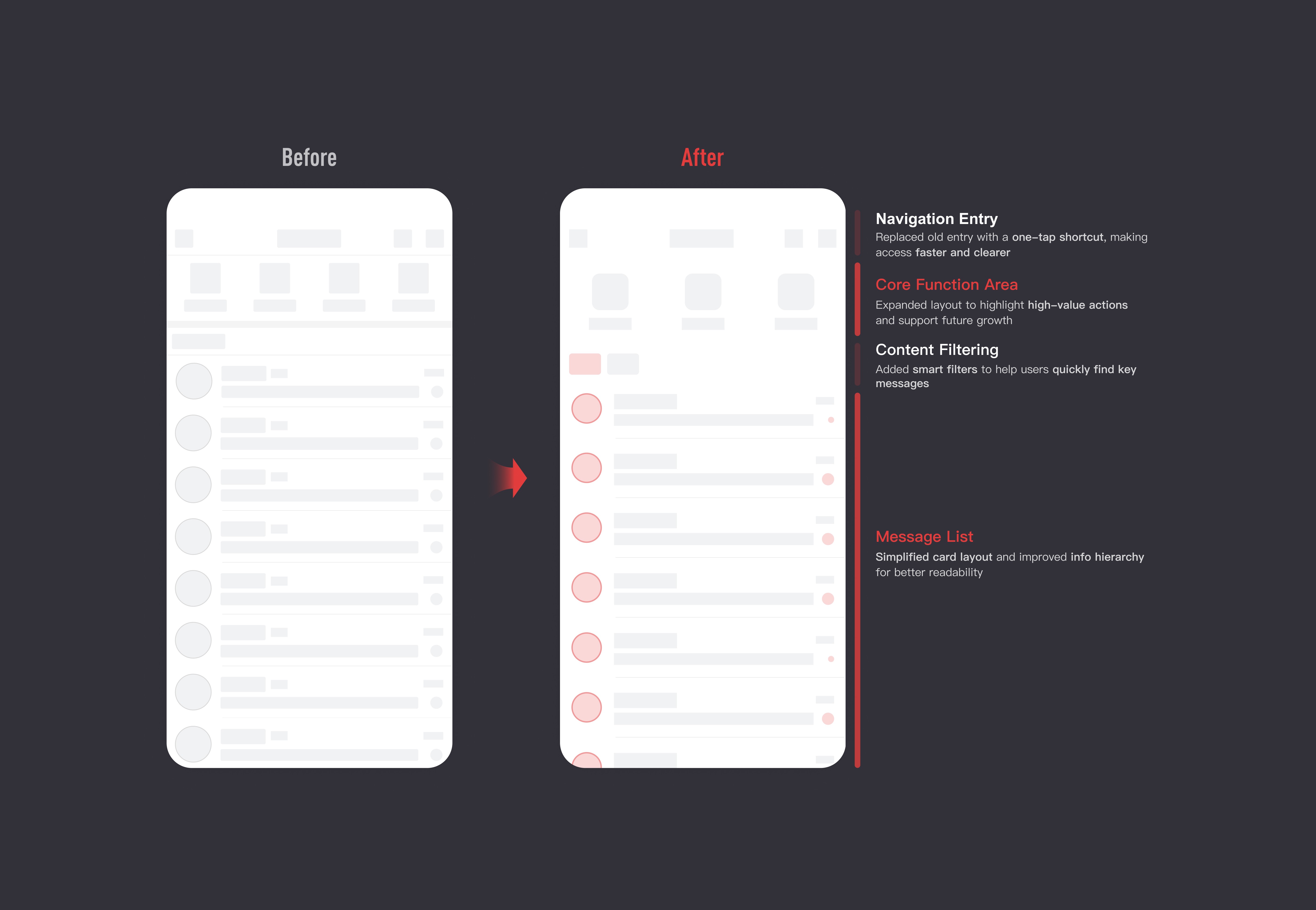
Design Execution
For Users – Clarity and Control
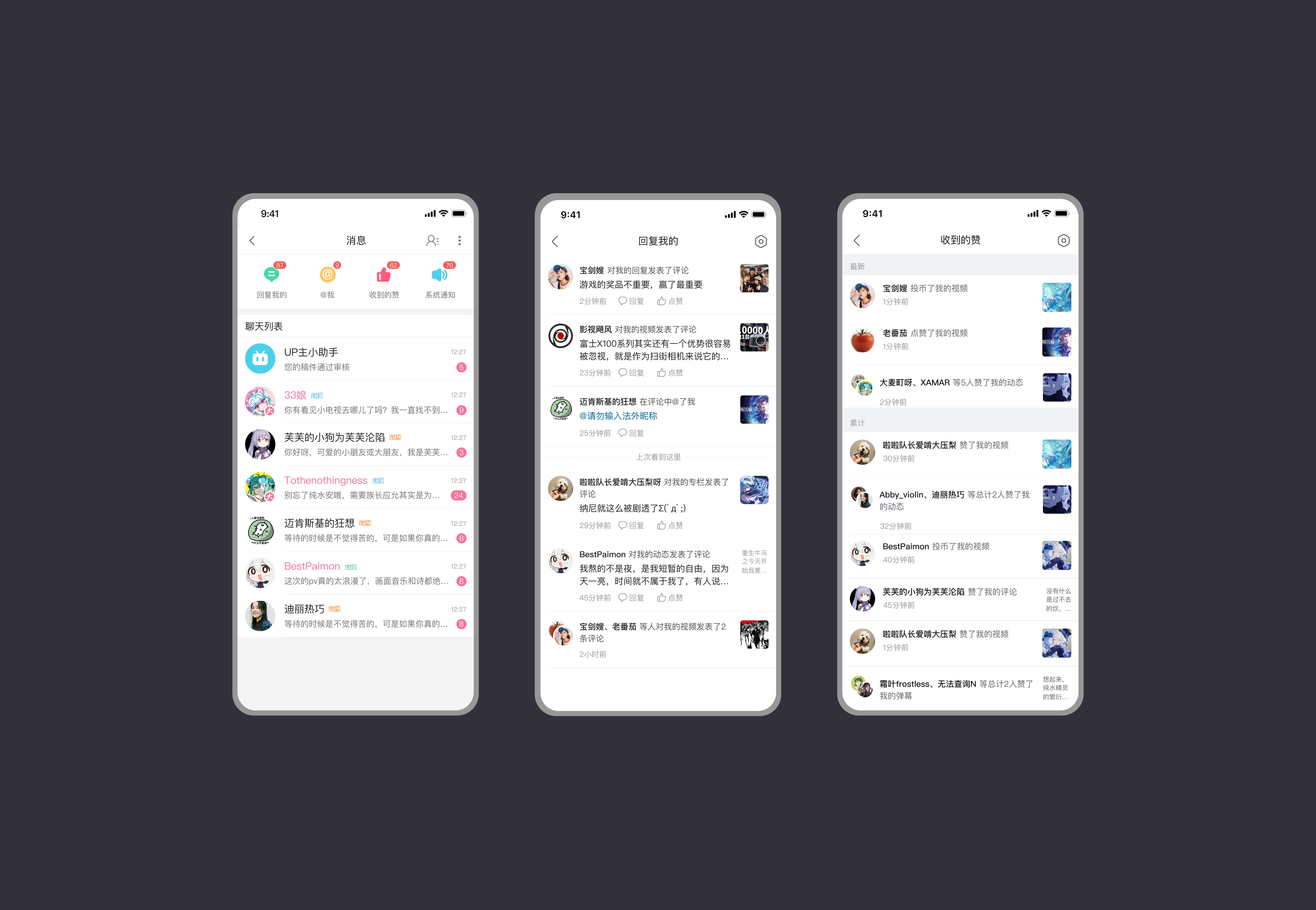
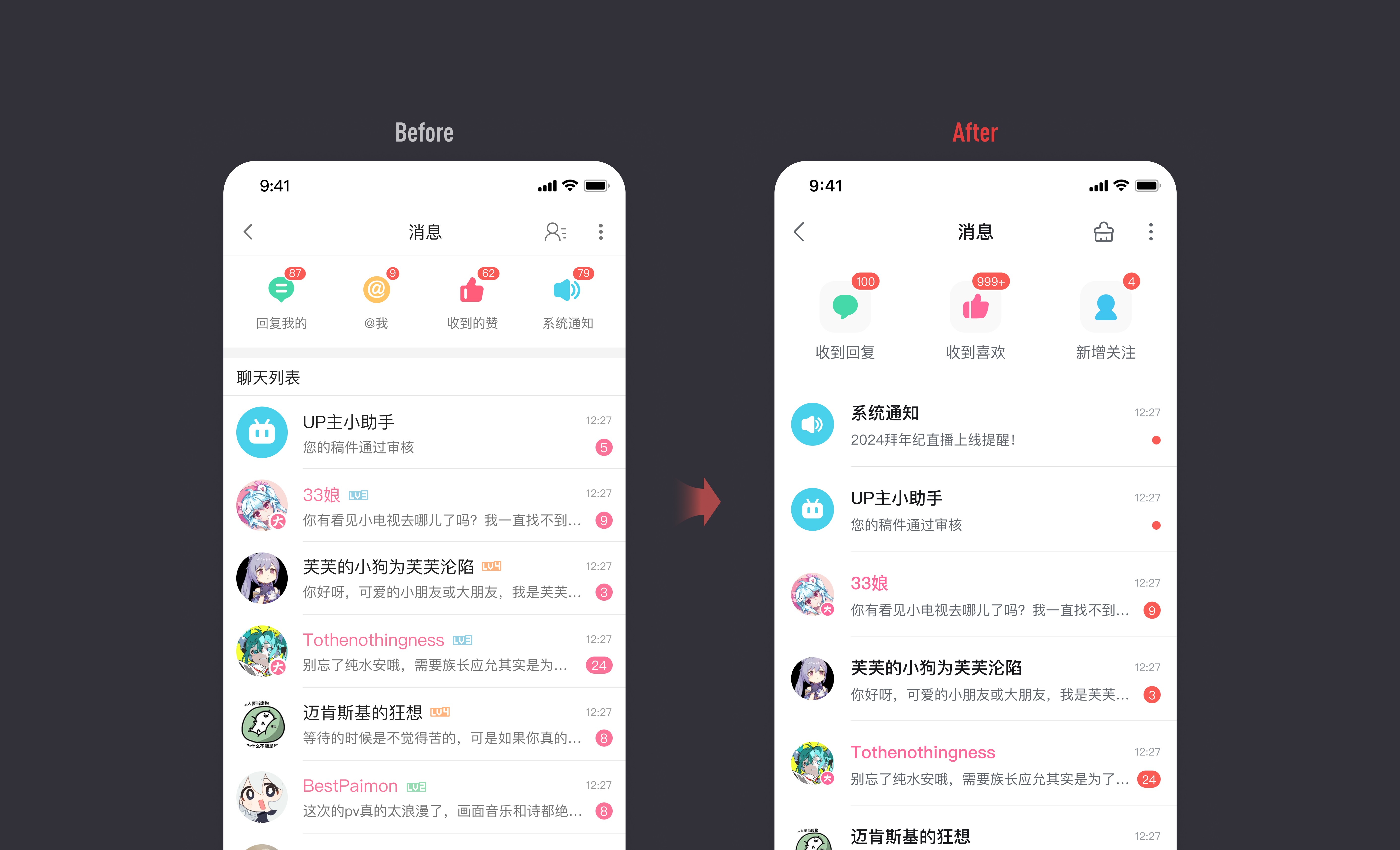
Faced with a cluttered inbox and low-value content overload, I focused on improving message hierarchy and cleaning efficiency. I restructured messages into two clear categories—User Interactions and Platform Services—to reduce cognitive friction and improve scanability.

For Creators – Faster Access and Higher Relevance
Creators needed faster access to key messages and more support for meaningful interactions, not just passive alerts.
01
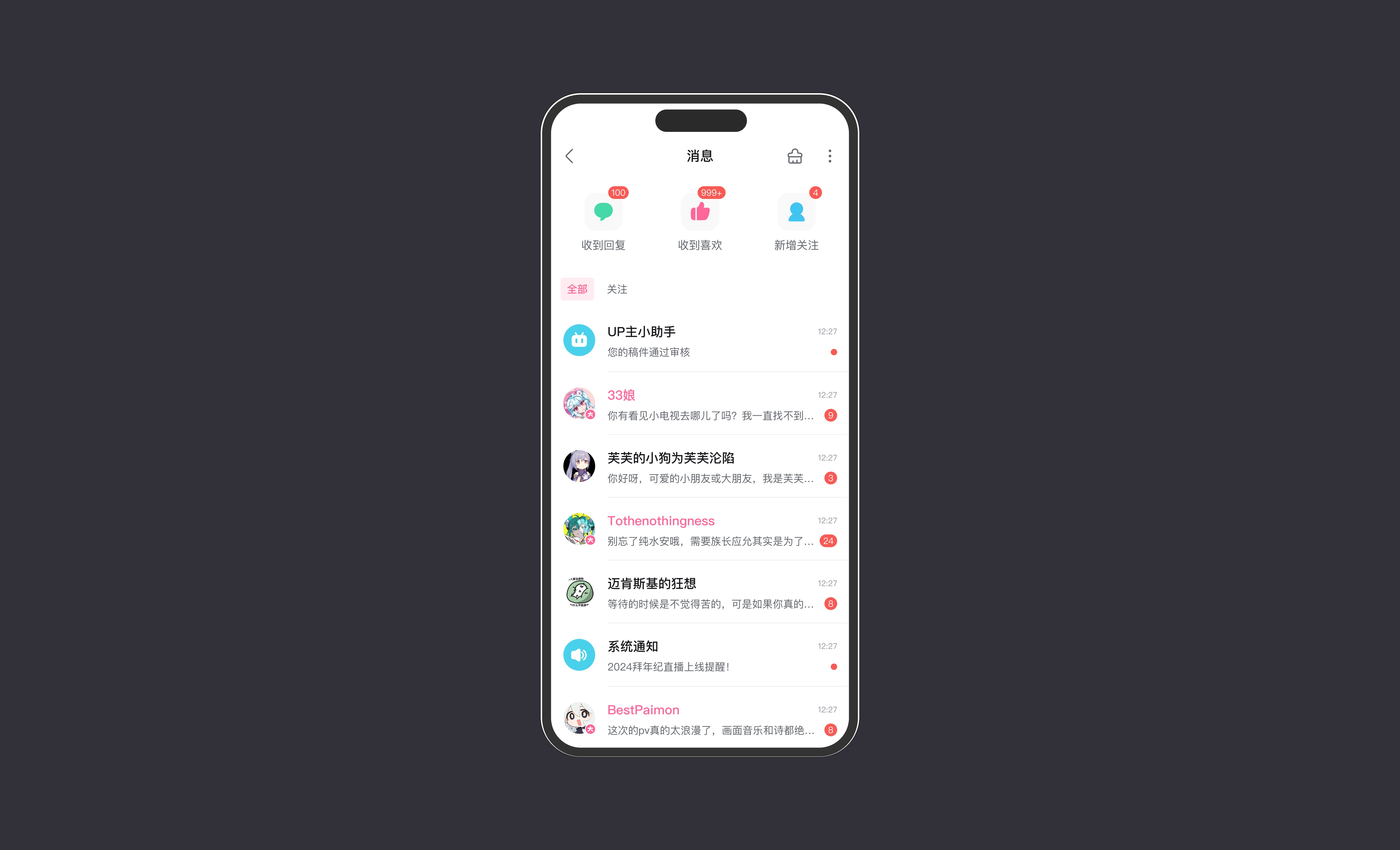
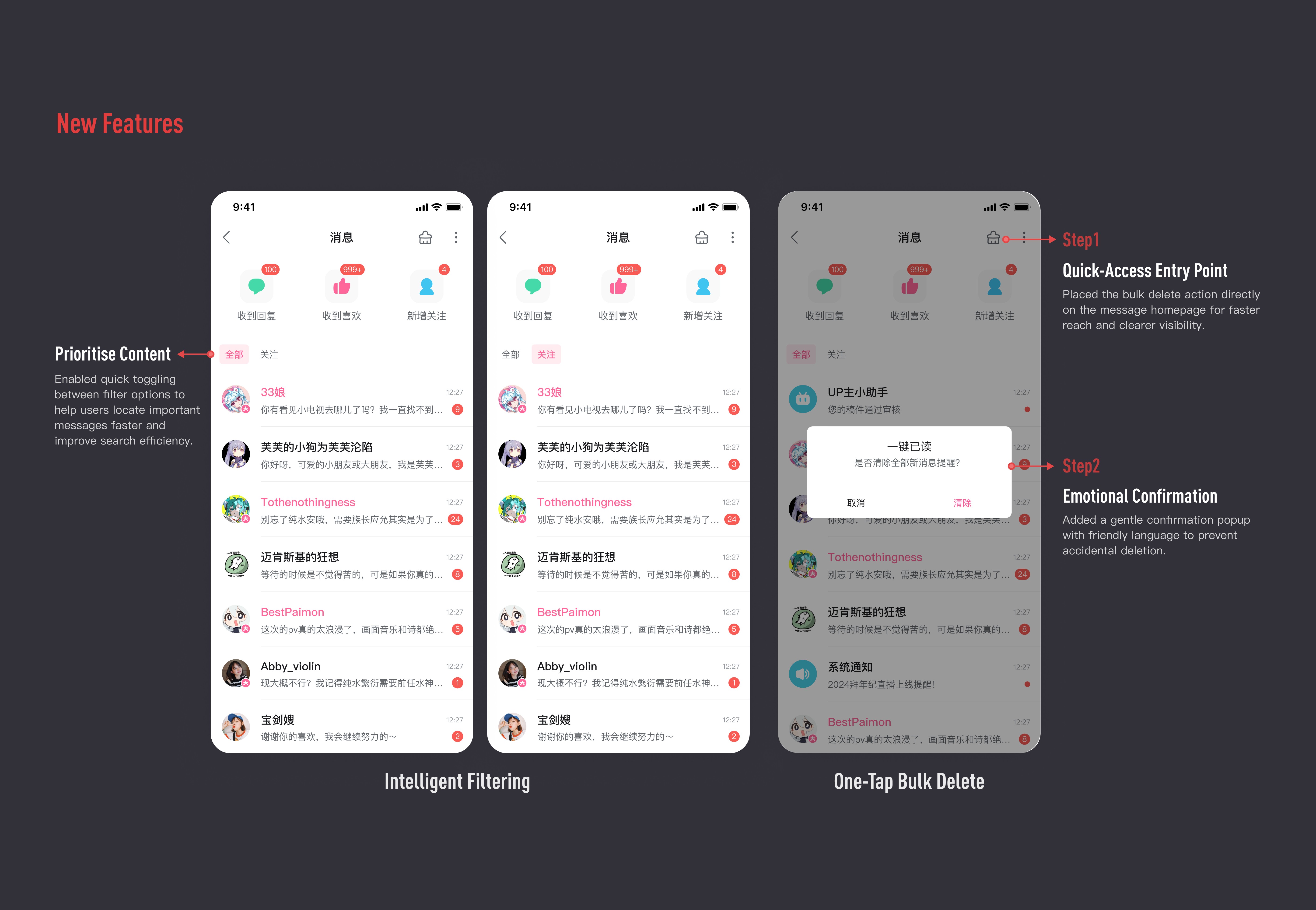
Quick Access: Rebalanced and Contextual
Deprioritised system notifications by relocating them to a list view, minimised visual prominence through badge-only alerts (red dot)

Streamlines functional architecture by consolidating repetitive interaction alerts (e.g., "@mentions/replies") into unified notifications
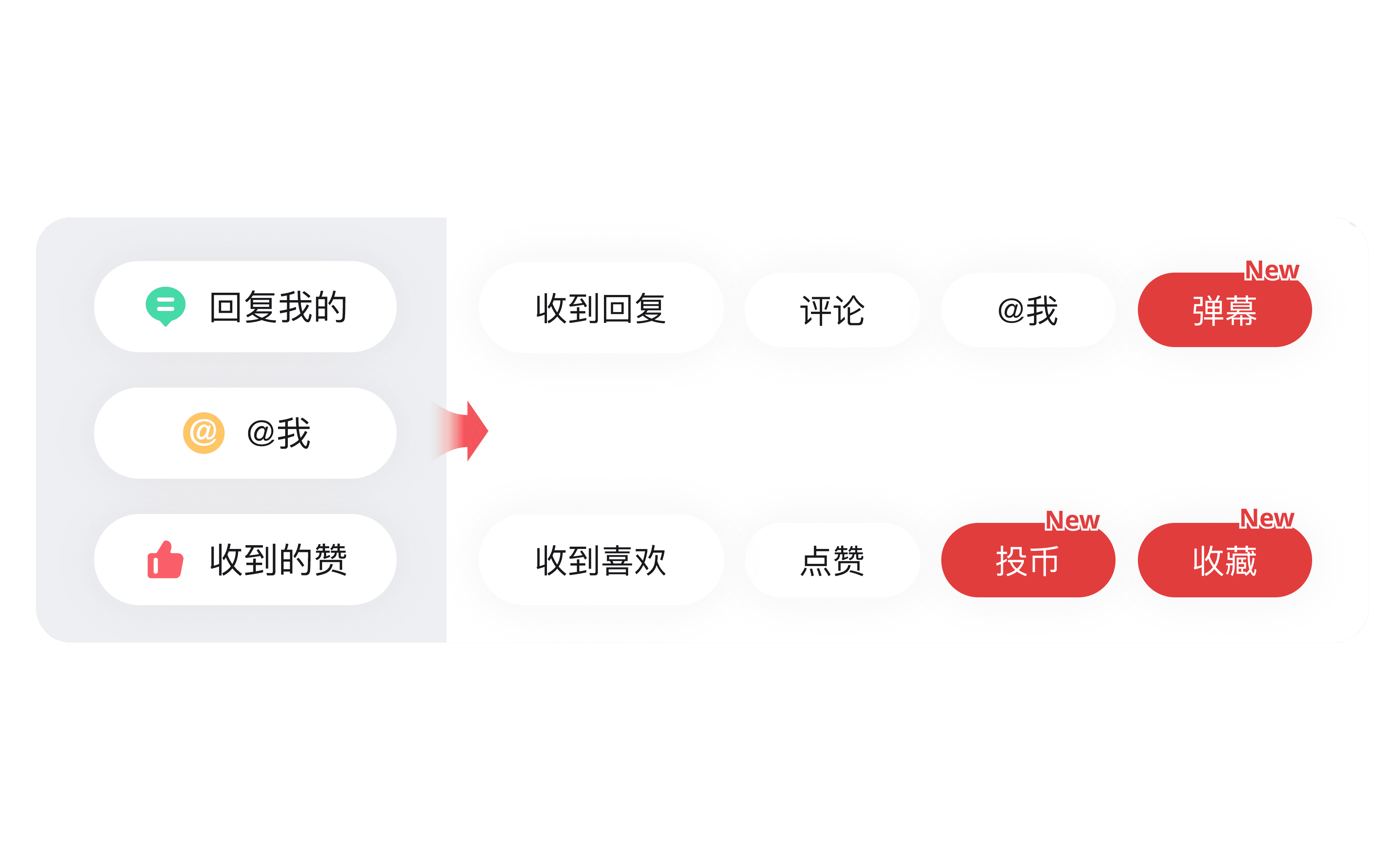
Introduces relationship-chain insights (e.g., "Fans who also follow X") to facilitate faster connections

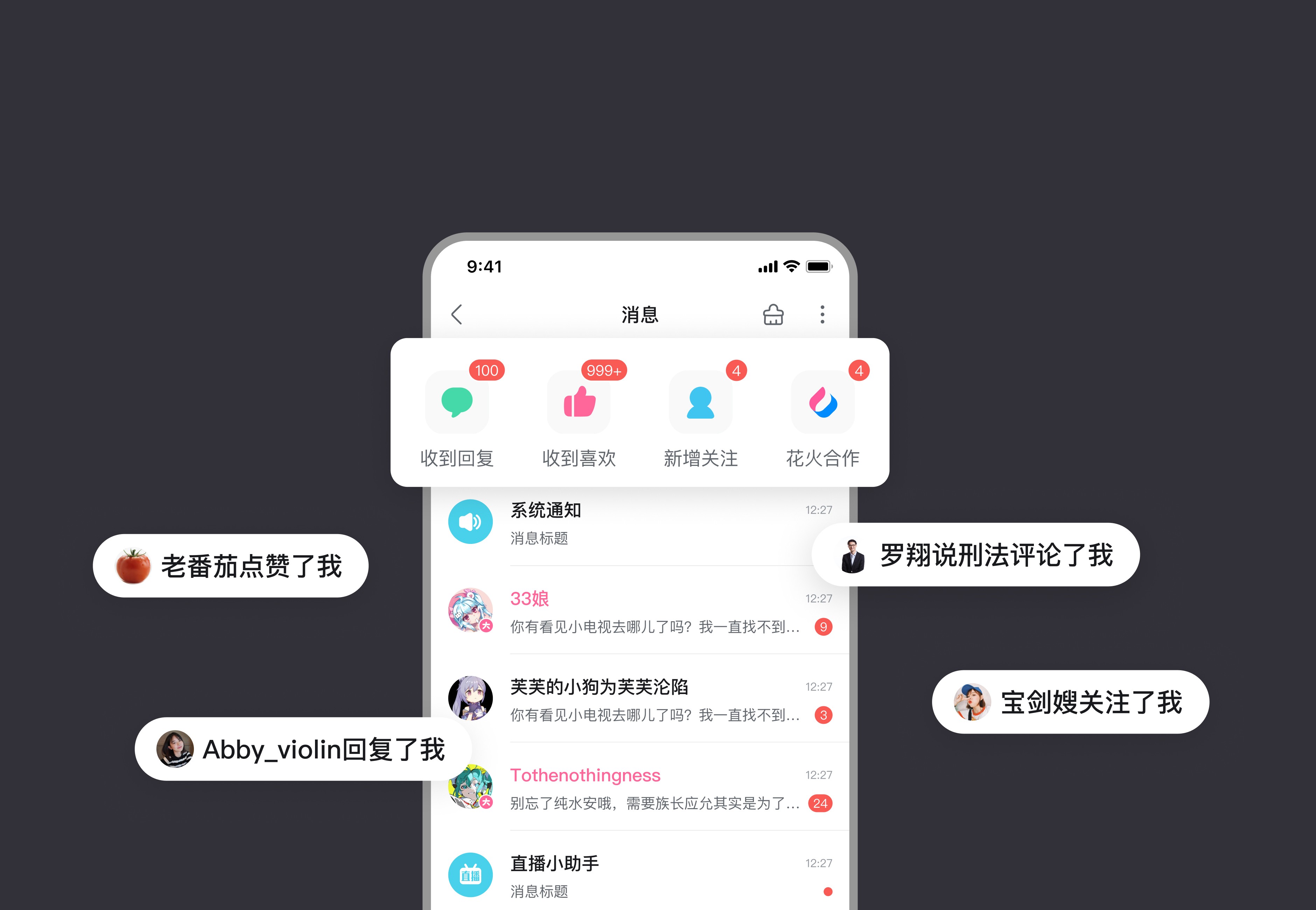
02
Action Prompts: More effective Call-to-Actions
To help important interactions stand out without being disruptive, I explored different prompt patterns ranging from homepage-level aggregation to subtle message alerts.
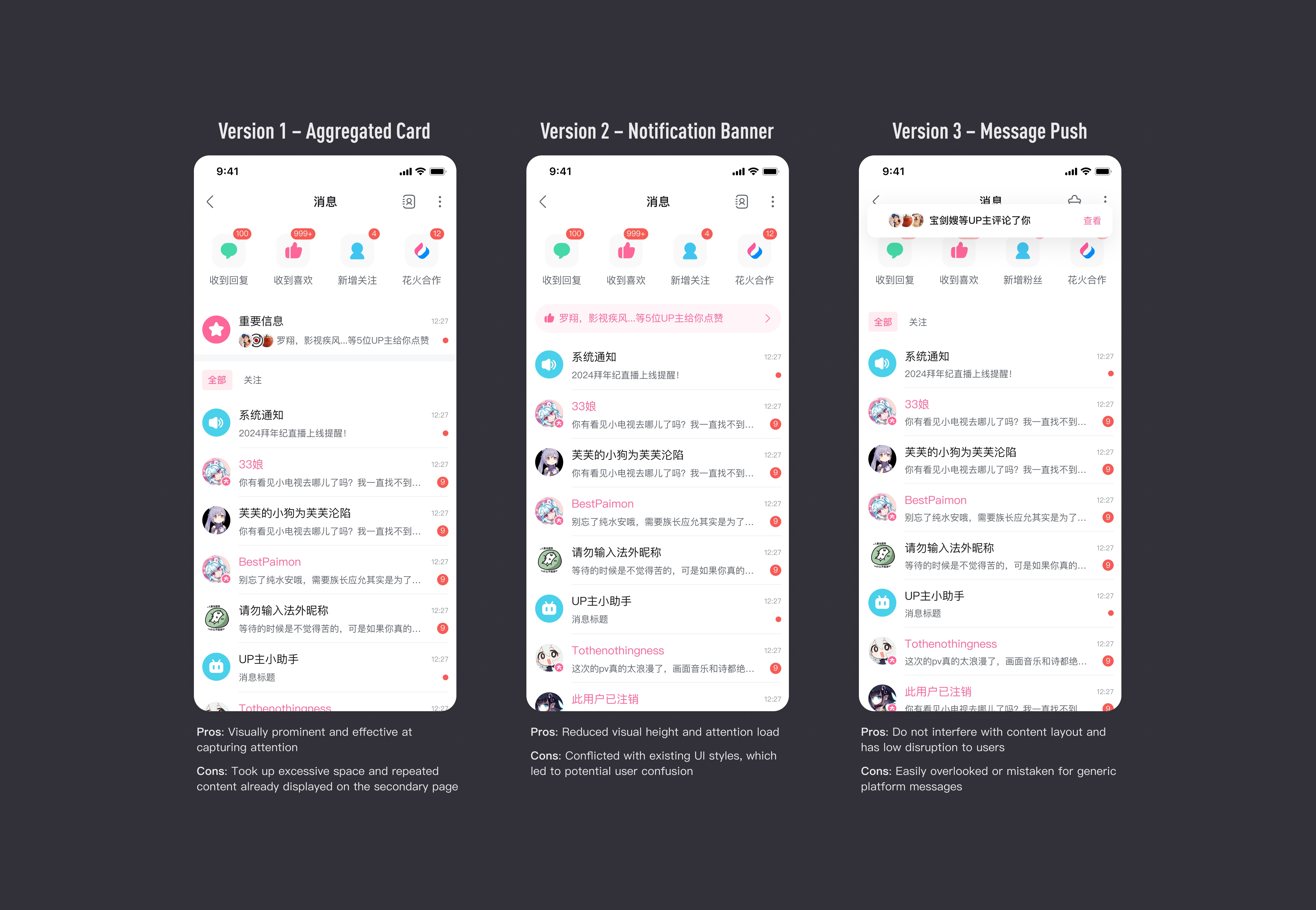
After evaluating trade-offs, I opted for a lightweight bubble prompt as the final solution. It strikes a balance between visibility and non-disruption, while aligning with the overall UI rhythm.

For Platform – Structural Clarity & Visual Consistency
To improve platform-level scalability and maintain a more consistent information experience, I restructured the message center layout and refined its visual hierarchy.