Overview
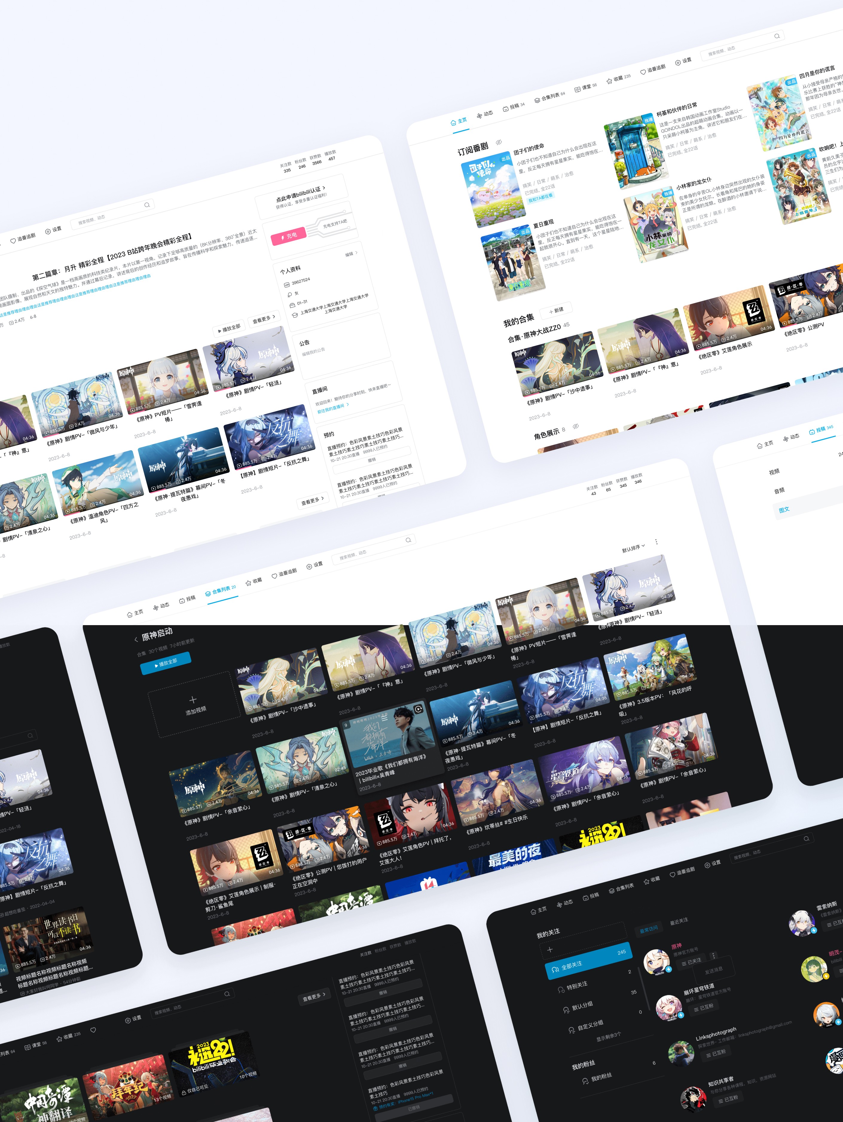
Bilibili is a leading Chinese video-sharing platform with over 326 million monthly active users, especially popular among Gen Z. The Personal Space is a crucial touchpoint that connects uploaders and fans, fostering engagement and community-building.
Problems
Although the Space website has undergone several functional iterations since its launch, it still suffers from:
Outdated architecture that doesn't support evolving user behaviors
Poor responsiveness across screen sizes
Visual inconsistency with other Bilibili products
These issues led to reduced user satisfaction and made the redesign a top priority.
Challenge & Strategy
As the solo designer, I had just 4 weeks to deliver over 10 pages, covering responsive grids, UI visuals, interaction logic, and design components. To manage this intense workload, I proposed an Agile Design approach: Deliver fast, test early, iterate often. This enabled faster handoffs and collaborative iteration with a 3-4 person dev team.

Key Painpoints
Our research team revealed 3 primary problems with the old website.

1. Stiff
The old Space page wasn't responsive, leading to poor user experience and lower search visibility
2. Dated
The site looked outdated, especially compared to the homepage and competitors.
3. Inconsistent
The inconsistent functionality and diverse elements displayed on the webpage create confusion for users.
Opportunities
Goals
We converted our key problems into opportunities to solve for during the redesign.
Stiff → Flexible
The new website should have a competitively fast performance by improving the grid layout and increasing the overall perceived framework responsiveness.
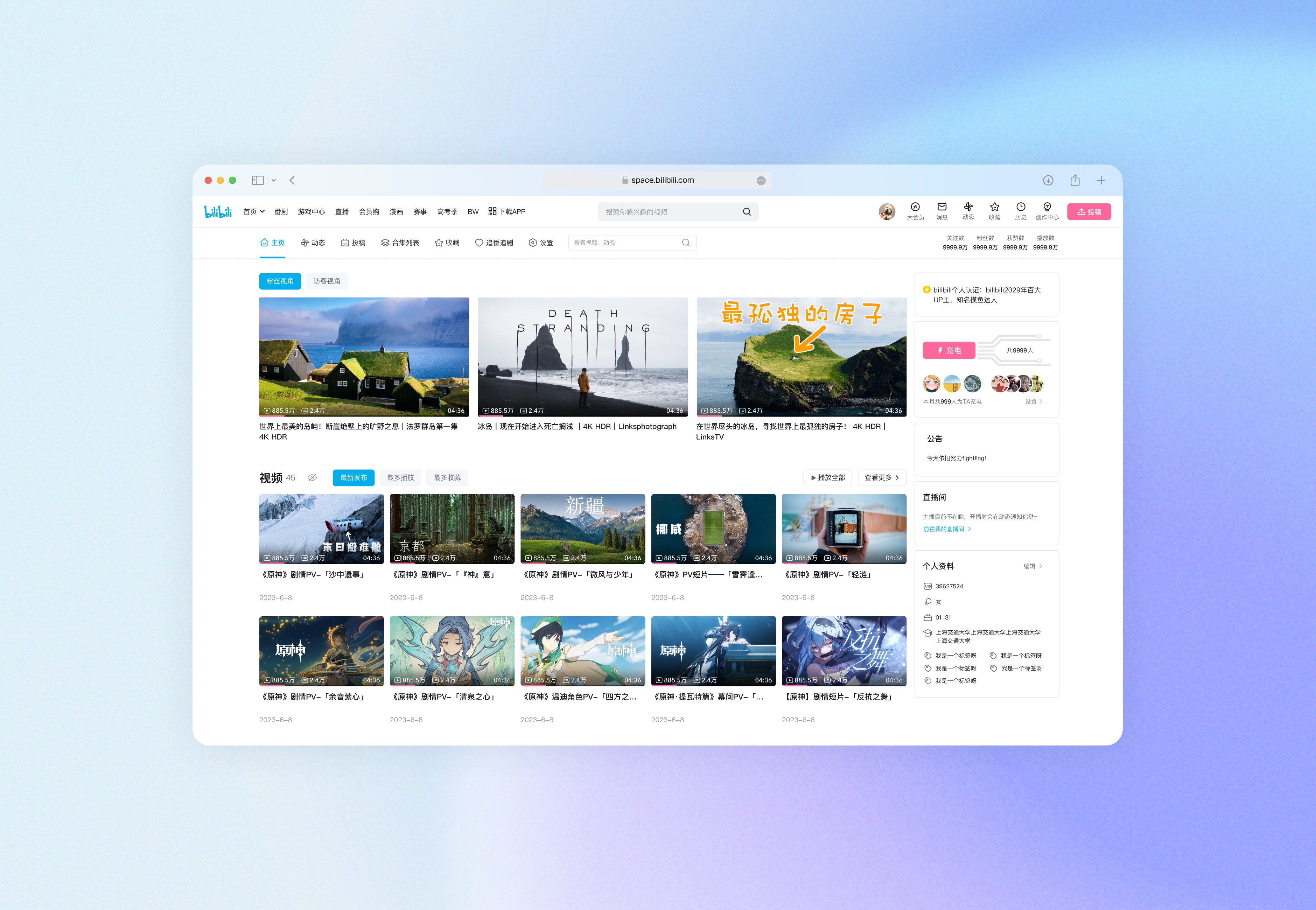
Dated → Modern
The website’s user interface should be visually refreshed to adhere to the bilibili design system, enhancing user experience while maintaining brand consistency.
Inconsistent → Unified
The redesign should update the design system, unify component styles, optimise user flow, and allow users to clearly understand functional operations.
Design Process
01
Exploration
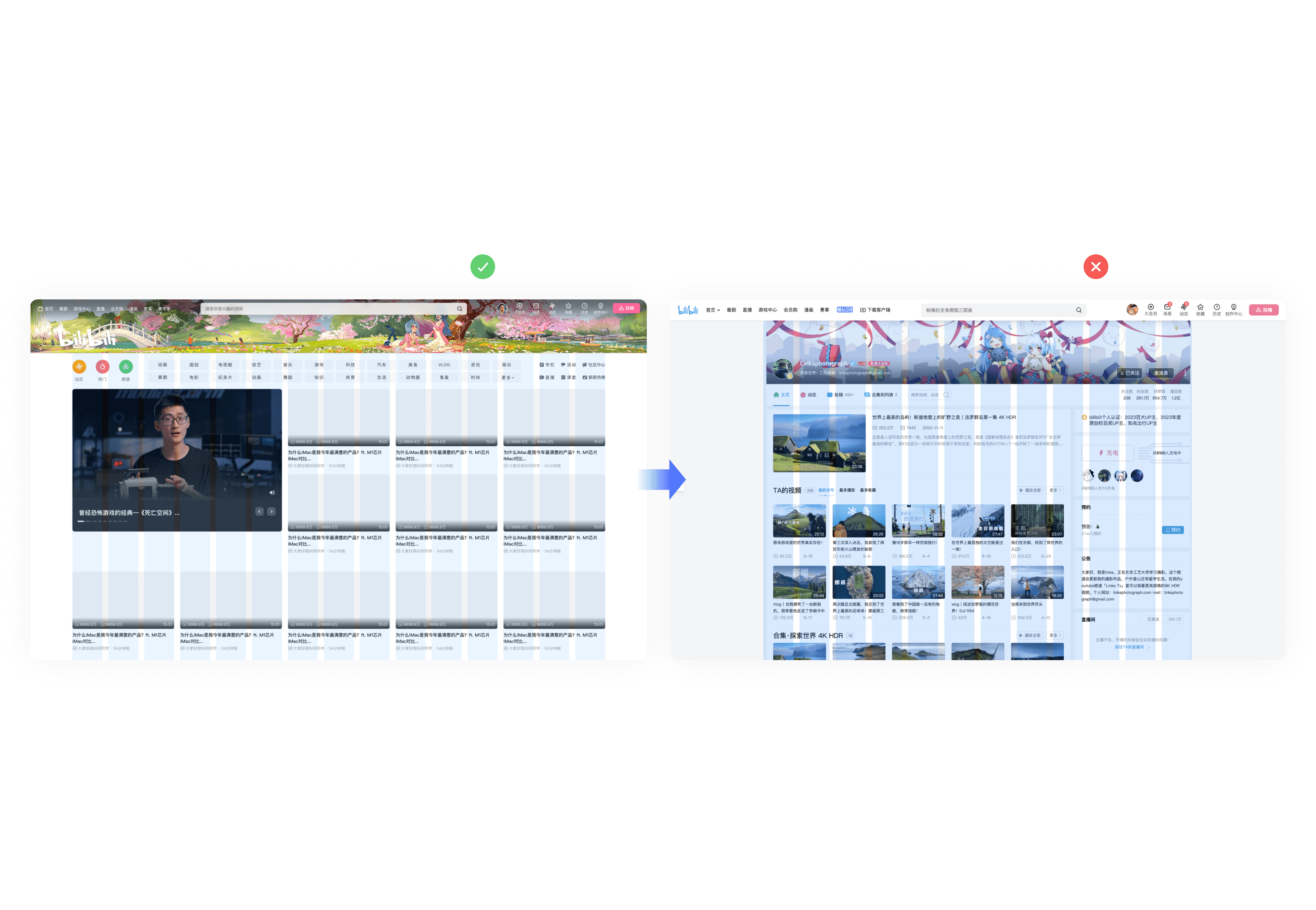
I first attempted to reuse the homepage grid system, but it didn't fit due to the difference in content types (card-based vs. image-text layouts).
02
Competitive analysis
I analyzed content-focused platforms like Weibo, Zhihu, Twitter, and concluded:
💡 Text-based content should be constrained to ~700px width to maintain readability on large screens.
03
User Data-Informed Breakpoints
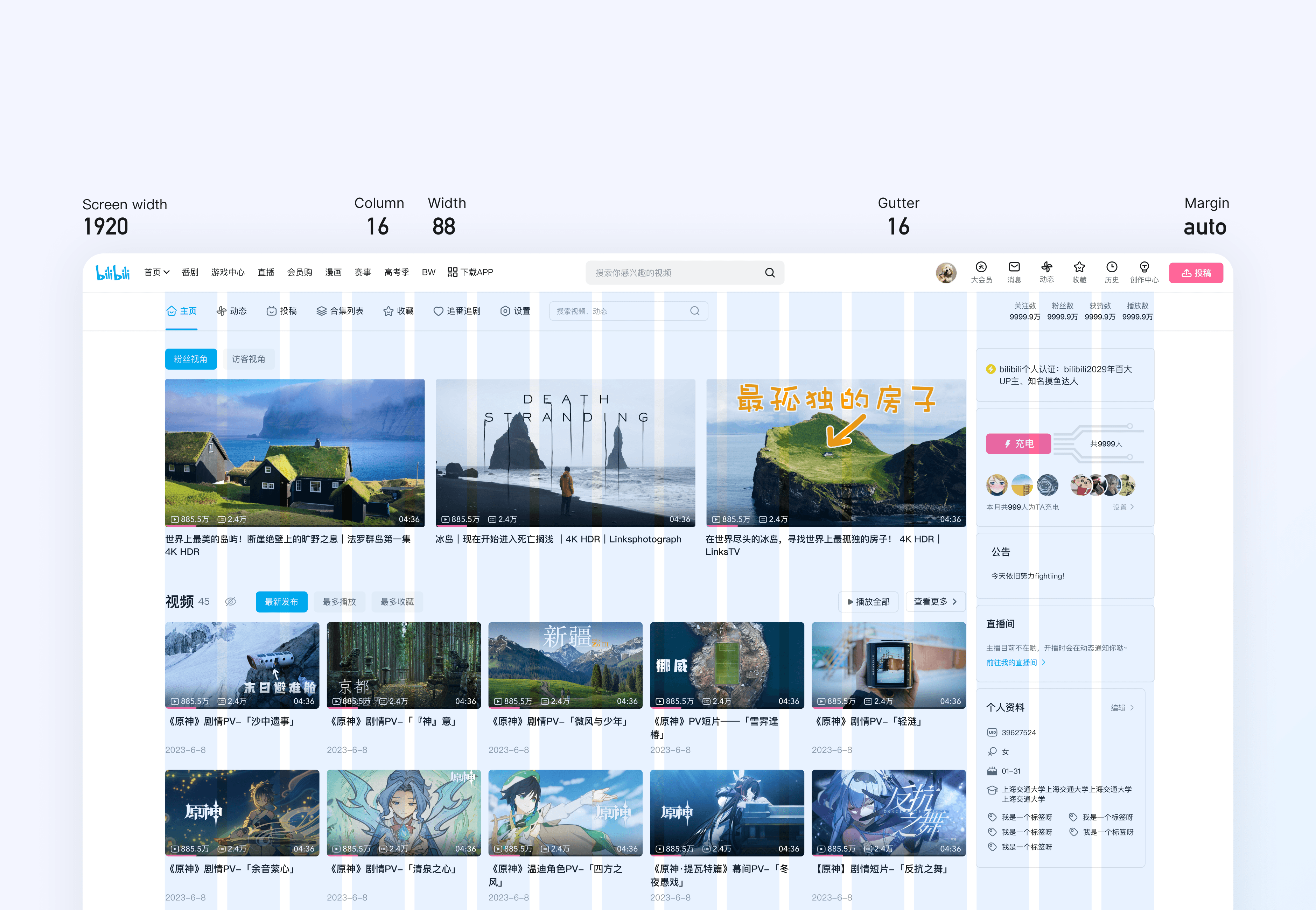
User device data showed: 53% use screens >1560px, 27% use screens 1280–1560px. Based on this, I defined 3 adaptive breakpoints to optimize the browsing experience across screen sizes.

04
Final Grid Design
Take a 1920px page as an example: the grid has 16 columns, the gutter is 16 wide, and the margin is adaptive. The cards in the content area are evenly divided according to the spacing.
01
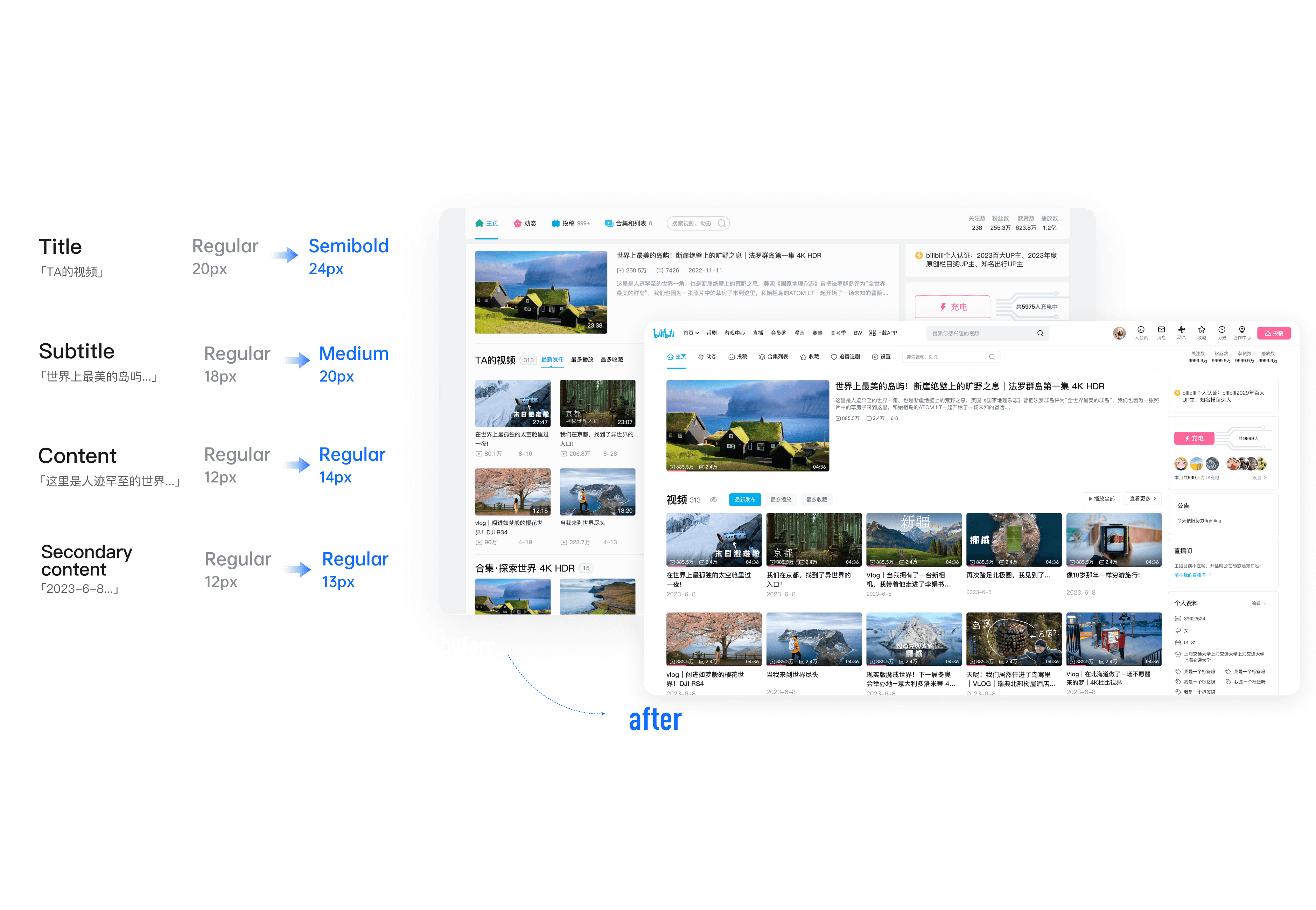
Typography & Colors
The original system had 8+ heading styles and inconsistent grays, leading to visual clutter. I optimized it by:
Reducing to 4 clear heading levels
Simplifying grayscale from 5 levels to 2 accessible contrast tones
02
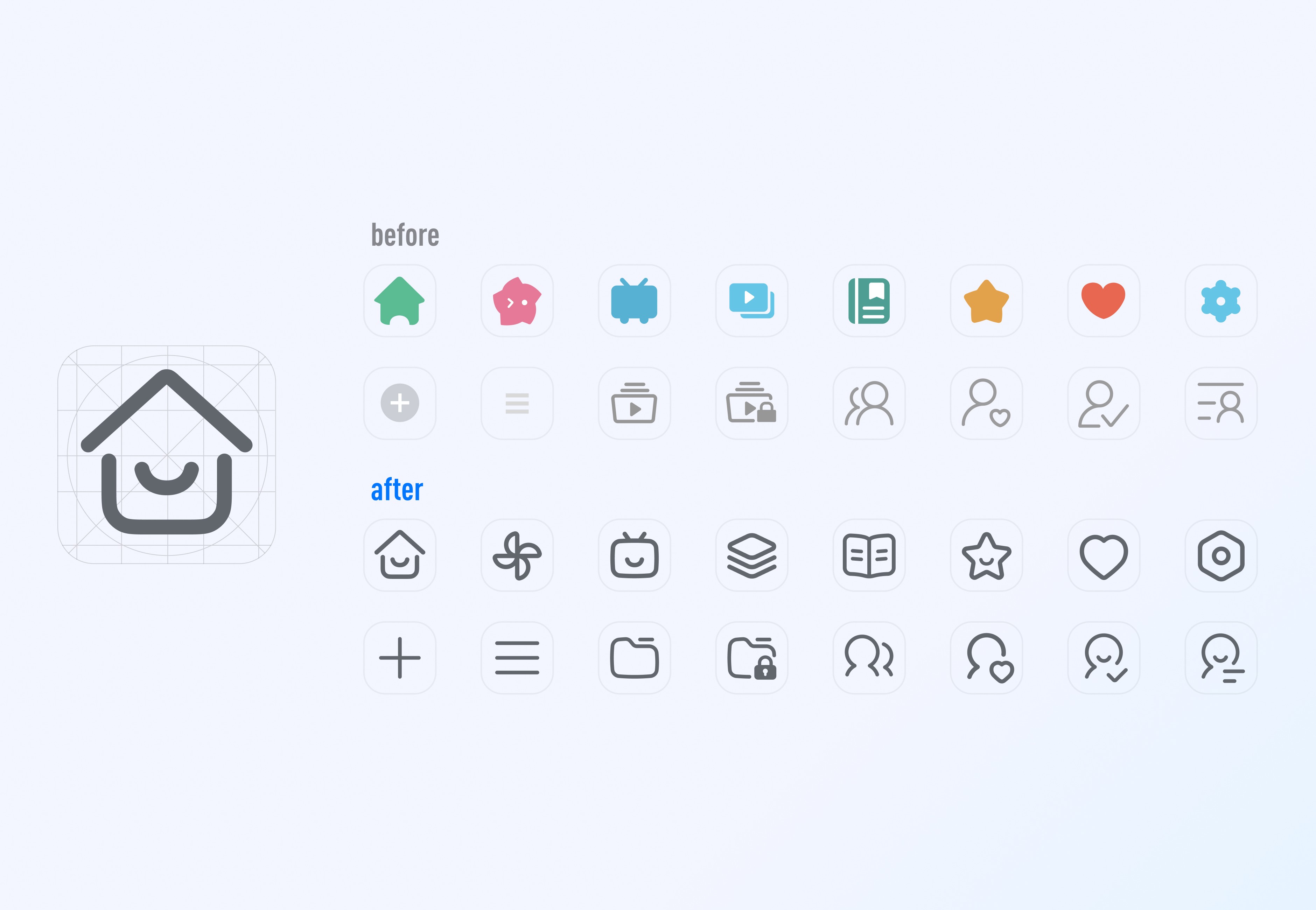
Iconography System
I redrew all icons across the Personal Space to match a unified linear style, ensuring neutrality and clarity.
03
Designed for Dark Mode
In parallel, I delivered a dark mode mapping system, not just as a visual inversion, but with thoughtful contrast calibration, laying the groundwork for future dark mode development.